

Portfolio strategy: Junk and S&P 500
Portfolio strategy: Junk and S&P 500
a short essay, by Riccardo Formenti

11/24/2020
Read in your browser
Stay with me for something slightly different than usual…
In this write up, we’ll be looking at the S&P 500 and at high yield bonds (a.k.a. junk bonds), and specifically at how it is possible, by adding a certain percentage of junk to a full equity portfolio, to achieve a better (historical) trade off between risk and return.
Keep in mind that:
[1] Being this an analysis of past data, it is, per definition, backward looking; past performances do not guarantee future performances.
[2] I’ll be using volatility (measured as stdev) as a proxy for risk. While I don’t believe this is always the case, I think it is a safe assumption to make in this context.

The “Efficient Frontier”
Before we start, a look at the data set used in this analysis:
Representing the S&P 500, I’ve used the daily adjusted (for dividends) closing price of SPY, from “Dec 28, 1998” to “Nov 16, 2020”. Data from Yahoo Finance.
Representing high yield bonds, I’ve used the daily closing price of ICE BofA US High Yield Index (let’s call it HYI for the sake of semplicity), from “Dec 28, 1998” to “Nov 16, 2020”. The index tracks the performances of “US dollar denominated below investment grade rated corporate debt publicly issued in the US domestic market (…)” with a “minimum amount outstanding of $100 million”; “index constituents are capitalization-weighted based on their current amount outstanding”. Data from the Federal Reserve Bank of St. Louis (FRED).
ps. in a couple of instances I found missing data points in the high yield set, trading days were the price was recorded as N/A. I used the following day closing price. It has no effect on the overall findings, but I wanted to point that out.
Risk free rate = 10 yrs. Treasuries constant maturity, data from FRED
Let’s start from a simple regression analysis, using SPY daily adj. closing day data as the independent variable [X axis] and HYI daily closing day data as the dependent variable [Y axis]:
Corrected from first publication
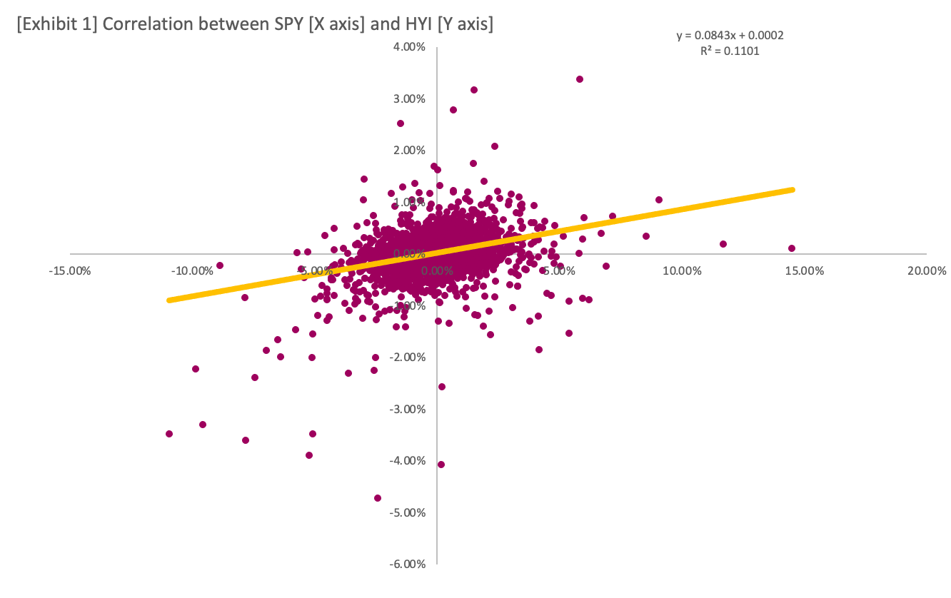
As [Exhibit 1] shows, there is little statistical correlation between SPY and HYI daily returns, with only 11% of HYI returns explained by moves in SPY (Rsquared).
After that, I used the daily data to calculate the expected annual return (as the arithmetical mean of return every 252 trading days, a calendar year) and standard deviation (as the stdev. of those returns):

I adjusted High Yield returns by subtracting 1.5% to account for [1] ETFs expenses and [2] current historical low yields across the board. The 5.81% return is in line with the current yield on major junk ETFs, namely $HGY and $JNK.
I imagined a series of different portfolio structures, ranging from 100% SPY and 0% HYI to 0% SPY and 100% HYI and everything in between in increments of 1% (99%/1%, 98%/2%, 97%/3%, etc.), and plotted the corresponding stdev. on the X axis and exp. return on the Y axis:
Exp. return = calculated as weighted expected return
Stdev. = here’s an overview of the formula

The quickest among you may have noted how there are certain suboptimal portfolio combinations that yield both lower returns with the same volatility or higher volatility with the same return than comparable portfolios. We need to eliminate these combinations to arrive at “the set of optimal portfolios that offer the highest expected return for a defined level of risk or the lowest risk for a given level of expected return”, also called “Efficient Frontier”:

[Exhibit 3] represents the set of portfolios with the highest level of return per x unit of risk assumed or, in other words, the only plausible choice of combinations for any rational investor (who would like to assume more risk to achieve the same rate of return, or achieve lower return but assuming the same risk?).
A rational investor would choose any combination between 100/0 and 38/62 based on his preference for higher returns or lower volatility.
But which portfolio is the most “efficient”? To answer this question I used the Sharpe ratio, calculated as:
(Exp. return - average risk free rate for data set) / Stdev.

[Exhibit 4] shows the Sharpe ratio per % SPY in portfolio. The most efficient portfolio structure lies in the middle, with approximately a 50/50 split between S&P 500 and junk bonds.
To end the matter, [Exhibit 5] shows the ∆ Sharpe, calculated as SPY Sharpe - HYI Sharpe. The more positive it is, the higher the risk (volatility) adjusted outperformance of the S&P compared to High yield. The opposite is also true.

As you can see, the delta tends to fall back to the median ∆ Sharpe of .24, signaling a slightly risk-adjusted outperformance of SPY over the analyzed time frame.
Conclusions
Today we’ve looked at data since the turn of the century for the S&P 500 and for high yield junk bonds, and we’ve concluded that, by adding a certain percentage of junk to a full equity portfolio, an investor can achieve an improved (historical) risk-adjusted profile.
Caveat emptor. Do not trust a 17 yrs. old on the internet. Do your own due diligence.